PROJECT #3 — logos
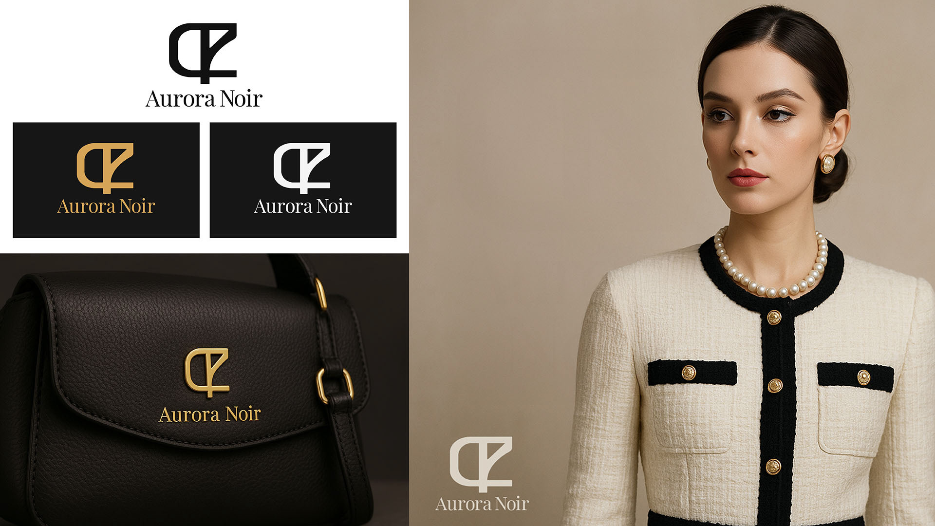
Aurora Noir
Industry: High-end fashion accessories (luxury handbags & jewelry).
Industry: High-end fashion accessories (luxury handbags & jewelry).
Brand Personality: Elegant, modern, mysterious, and bold.
Target Audience: Stylish professionals, trendsetters, and individuals who appreciate sophistication and exclusivity.
Logo Type: Combination mark (symbol + wordmark).
Style Keywords: Minimal, timeless, sleek, confident.
Style Keywords: Minimal, timeless, sleek, confident.
Colors to Use:
• Primary: Black, charcoal, or deep navy
• Accent: Silver, rose gold, or muted purple (Avoid green and yellow completely)
• Primary: Black, charcoal, or deep navy
• Accent: Silver, rose gold, or muted purple (Avoid green and yellow completely)
Usage:
• Website & e-commerce store
• Luxury packaging (embossed on leather, printed on boxes)
• Social media profiles & ads • Jewelry tags and handbag
• Website & e-commerce store
• Luxury packaging (embossed on leather, printed on boxes)
• Social media profiles & ads • Jewelry tags and handbag
branding Inspiration & Direction:
• Think Chanel, Prada, or Yves Saint Laurent level simplicity
• Abstract symbol that suggests light/reflection, or a unique monogram twist
• Clean typography with a slightly custom detail
• Think Chanel, Prada, or Yves Saint Laurent level simplicity
• Abstract symbol that suggests light/reflection, or a unique monogram twist
• Clean typography with a slightly custom detail
Northpeak Outdoor Gear
Company Description:
Northpeak is a mid-range outdoor gear brand based in a cold-climate region.
They sell jackets, hiking boots, camping equipment, and winter sports accessories.
The company focuses on durability, reliability, and a connection to nature.
Their main competition is brands like Patagonia, The North Face, and Columbia, but they position themselves as more affordable while maintaining high quality.
Target Audience:
* Primary: Outdoor enthusiasts aged 20–40, split between casual hikers and experienced adventurers
* Secondary: Families who enjoy weekend camping trips
* They value authenticity, environmental responsibility, and a rugged yet modern style.
* Primary: Outdoor enthusiasts aged 20–40, split between casual hikers and experienced adventurers
* Secondary: Families who enjoy weekend camping trips
* They value authenticity, environmental responsibility, and a rugged yet modern style.
Design Requirements:
* Logo must work in one color for embroidery, patches, and stamping on gear
* Must be recognizable in small sizes (think backpack tags, zipper pulls)
* Avoid overly detailed illustrations that will be lost when scaled down
Incorporate at least one of the following themes visually:
Mountains, peaks, Compass, navigation elements, Nature (trees, rivers, etc.)
Typeface should feel modern but rugged — sans serif or slab serif recommended
Color palette:
* Primary: Deep green or navy blue (client open to suggestions)
* Secondary: Neutral accents like white, beige, or grey
Deliver both a full logo (with name) and a monogram or emblem that works without the text
* Primary: Deep green or navy blue (client open to suggestions)
* Secondary: Neutral accents like white, beige, or grey
Deliver both a full logo (with name) and a monogram or emblem that works without the text
Planned Use-Cases:
Embroidery on jackets and hats, Laser etching on stainless steel bottles, Print and digital ads, Social media profile pictures, Company Values:, Sustainability (eco-friendly materials), Community (supports local hiking groups), Reliability (gear that lasts years)
Embroidery on jackets and hats, Laser etching on stainless steel bottles, Print and digital ads, Social media profile pictures, Company Values:, Sustainability (eco-friendly materials), Community (supports local hiking groups), Reliability (gear that lasts years)
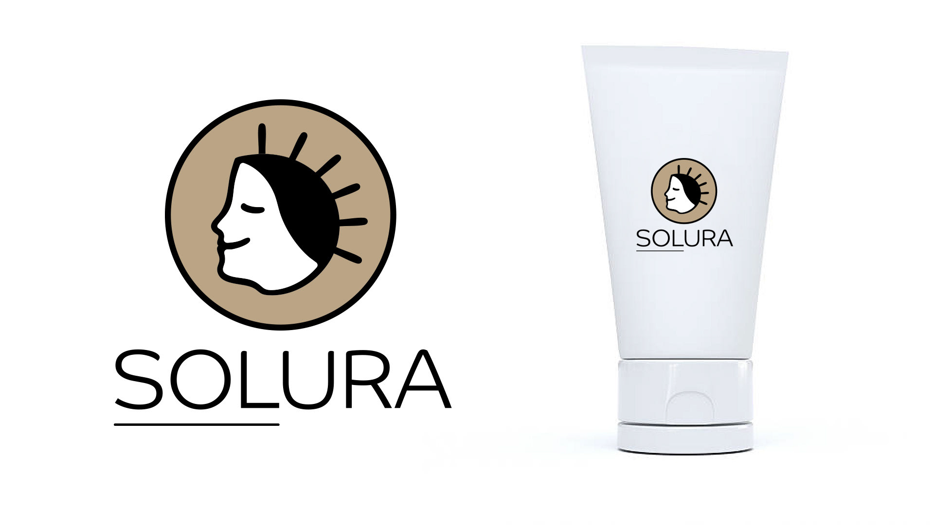
Solura
Industry: Sustainable Skincare & Wellness
About the Brand / What They Do:
- Solura is a sustainable skincare company specializing in natural, eco-friendly products designed for everyday use.
Their product line includes:
- Moisturizing creams & body lotions
- Gentle face cleansers
- Anti-acne serums & spot treatments
- Mineral-based sunscreens
- Essential oils & wellness balms
All products are plant-based, cruelty-free, and packaged in recyclable or biodegradable materials.
Brand Personality:
- Calm and pure, like a morning ritual
- Modern and minimalistic
- Natural and eco-conscious
- Trustworthy and premium
- Calm and pure, like a morning ritual
- Modern and minimalistic
- Natural and eco-conscious
- Trustworthy and premium
Target Audience:
- Health- and environment-conscious individuals aged 20–40
- Young professionals, students, and wellness enthusiasts
- People who prefer clean-label, organic alternatives over chemical-heavy skincare
- Health- and environment-conscious individuals aged 20–40
- Young professionals, students, and wellness enthusiasts
- People who prefer clean-label, organic alternatives over chemical-heavy skincare
Logo Type:
- Combination mark (abstract natural symbol + clean wordmark)
- Must be versatile enough to work on product packaging, social media, and digital platforms
- Combination mark (abstract natural symbol + clean wordmark)
- Must be versatile enough to work on product packaging, social media, and digital platforms
Style Keywords:
• Minimal • Organic • Modern • Timeless • Soothing • Premium
• Minimal • Organic • Modern • Timeless • Soothing • Premium
Colors to Use:
- Primary: Soft beige / sand tones (natural, calming)
- Accent: Warm terracotta or muted copper (earthy, grounded)
- Neutral: White/off-white for clean contrast
- Primary: Soft beige / sand tones (natural, calming)
- Accent: Warm terracotta or muted copper (earthy, grounded)
- Neutral: White/off-white for clean contrast
Restrictions:
- Must be easily recognizable in monochrome (black & white)
- Avoid typical “green leaf” clichés and overused eco icons
- No overly sharp or harsh geometric shapes — flow and balance are key
- Must be easily recognizable in monochrome (black & white)
- Avoid typical “green leaf” clichés and overused eco icons
- No overly sharp or harsh geometric shapes — flow and balance are key
Logo Inspiration / Direction:
- Abstract sun shapes (to hint at natural energy + sunscreen)
- Flowing water lines (purity + hydration)
- Simplified organic forms (leaves, seeds, or drops)
- Geometric minimalism (a mark that feels modern and scalable)
- Abstract sun shapes (to hint at natural energy + sunscreen)
- Flowing water lines (purity + hydration)
- Simplified organic forms (leaves, seeds, or drops)
- Geometric minimalism (a mark that feels modern and scalable)
The goal is a logo that communicates calm luxury and natural effectiveness without being loud or trendy. Something timeless that can carry the brand for years.
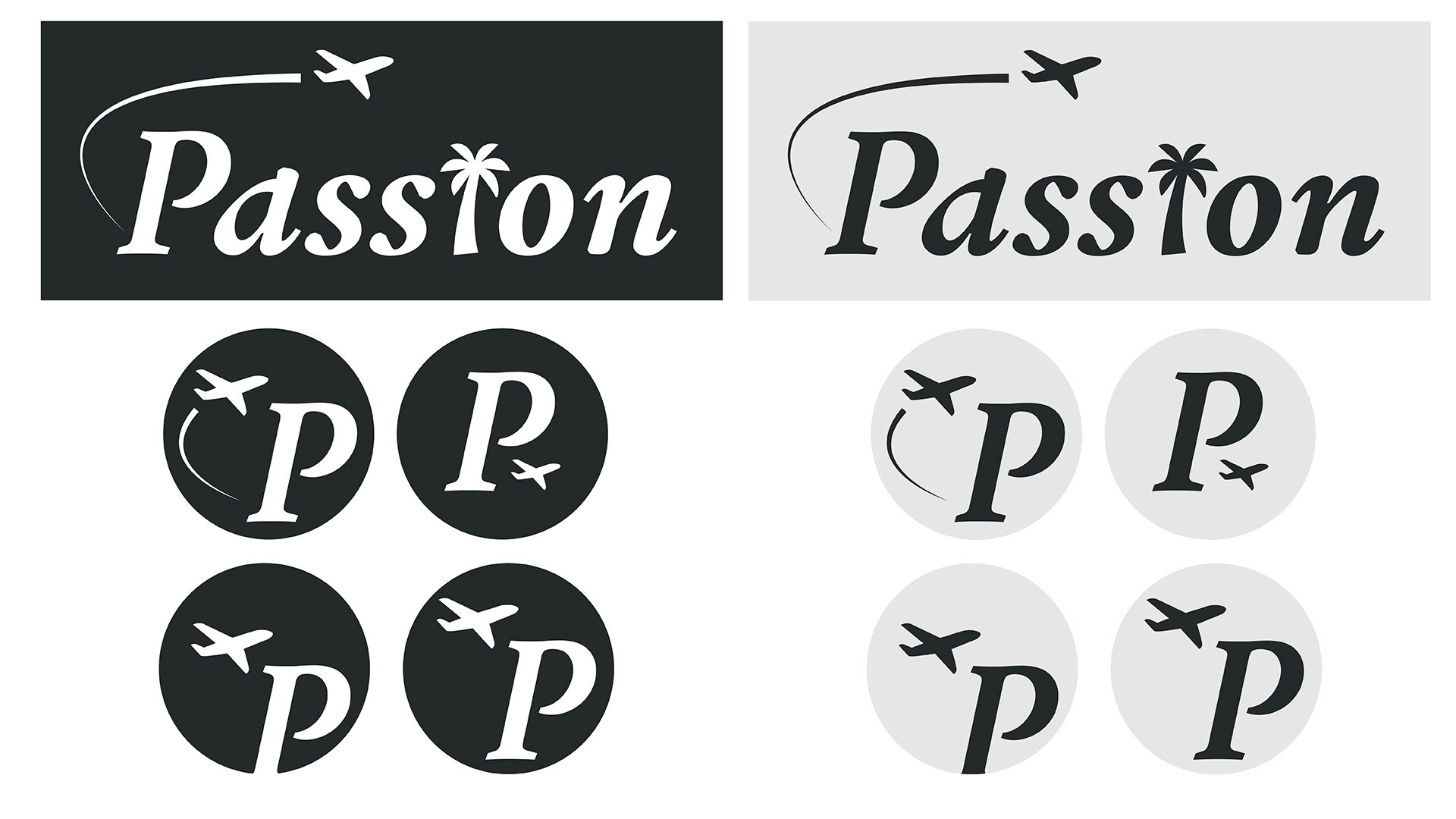
Passion
Company Description:
We offer a variety of luxury destinations. We are able to offer an authentic experience because of our easy-to-use app. Our target audience is college students. We want to convey a sense of fame, while at the same time being kind.
Job Description:
You must create a logo using the information given in this brief.
They would prefer a combination mark that uses the color grey.
The logo will be embroidered on uniforms.
Take into account the company's values and preferences, and make sure it will work for the planned use-cases.